Tuesday, May 10, 2011

Bisabuela


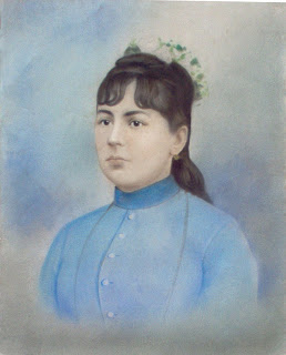
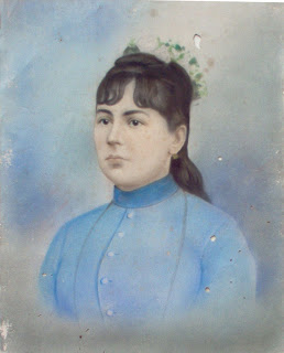
(Before) (After)


For the Bisabuela project we had to restore the original photo, and make it better using Photoshop. I liked this project, and found it pretty easy. First, I cleared up all of the holes using the clonestamp. I then brightened the photo, and enhanced her hair color.

Things to do in Chicago


Here is my midterm, the finished webpage. I thought that it could've turned out better. I think it's too simple, but let me tell you what I've done. The webpage was designed in inDesign, which I'm getting better at using. At the top of the webpage I decided to put a navigation link, to give it a more realistic feel. I also have multiple small pictures at the top, and a black (scroll bar) at the bottom so one can scroll through the pictures, click on one and select it then, the picture will enlarge like you see in the above picture ( the acrobat men).

Museum of Snow Statues


(AFTER)
(BEFORE)

For my midterm I had to create a webpage of an event that I've attended. Therefore, my roommate and I decided to go to the Navy Pier to visit the snow statues. Actually, we didn't plan on seeing the statues, but we did go to Navy Pier and they happened to be there. It was a great surprise! For the project we had to re-edit the photos, and change them to tiff. I also made the picture brighter(since it was a cloudy day), and erased the dirt, and foot steps from the snow. I thought that it made the picture look kind of sloppy with them.

Friday, March 4, 2011

Information Graph

I wanted to keep this graph simple, and I didn't want it to be too cluttered, because there was a lot of facts on him. Therefore, I decided to just do a timeline of his highest points in his career. I chose to do this, because I needed this graph for another class. All of the information on the timeline I found at the nytimes website

Monday, February 21, 2011

Composition


In this exercise we had to copy the layout of an article. I found this exercise pretty easy, not too difficult. I also thought it was fun. There were a couple of things that I didn't know how to do, but I figured them out. Which helped me learn how to use photoshop.

Friday, February 18, 2011

Color Warm


When putting together the color palette for this picture I really wasn't sure what I was going to do. To help me I decided to look up warm colors. After a couple of minuets browsing I saw a picture of this lovely living room. The living room had most of the colors that I used in this picture, and it worked our really nice. I never thought that these colors would look good with each other, but they did. I decided to do an all brown/maroon background because the wooden floors of the living room where that color therefore, I used that as my base.

Color Cool

When editing this picture, I changed up the colors ALOT. It was kind of difficult trying to find what I actually wanted and what really worked. When looking at this picture it reminds me of a child's playroom, or a carnival. Something fun, and playful.